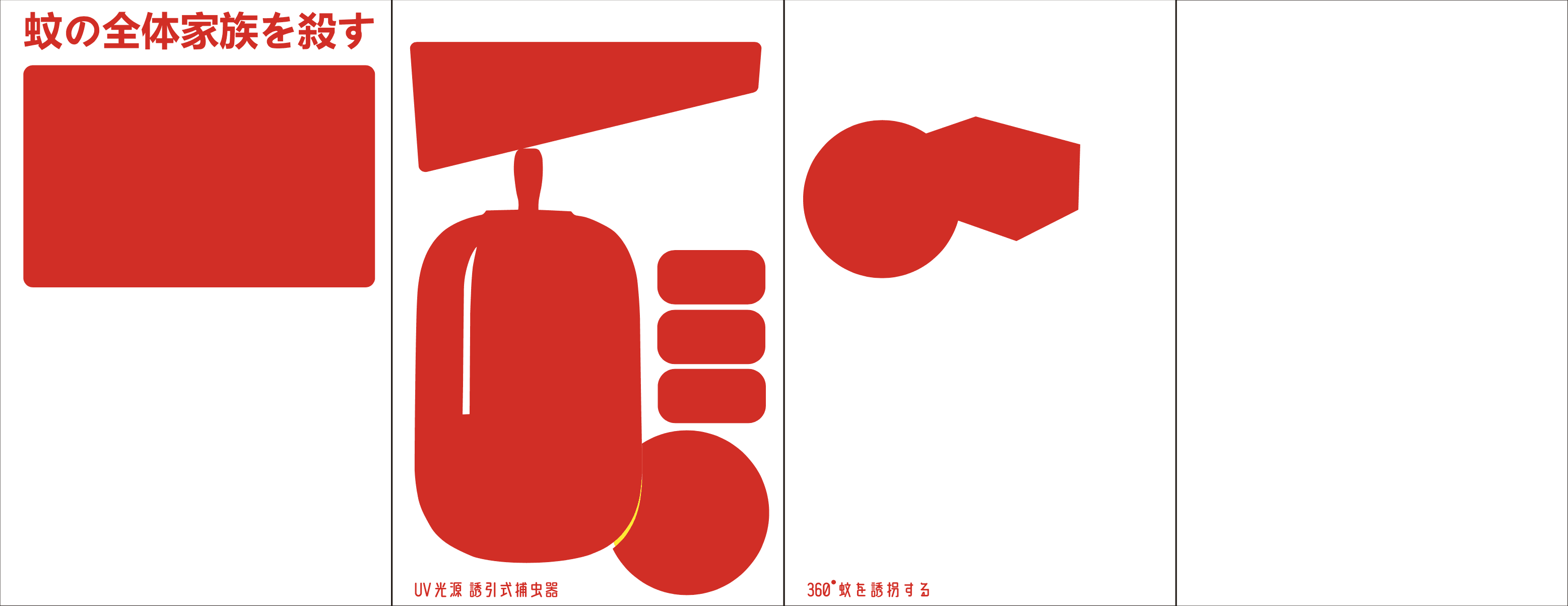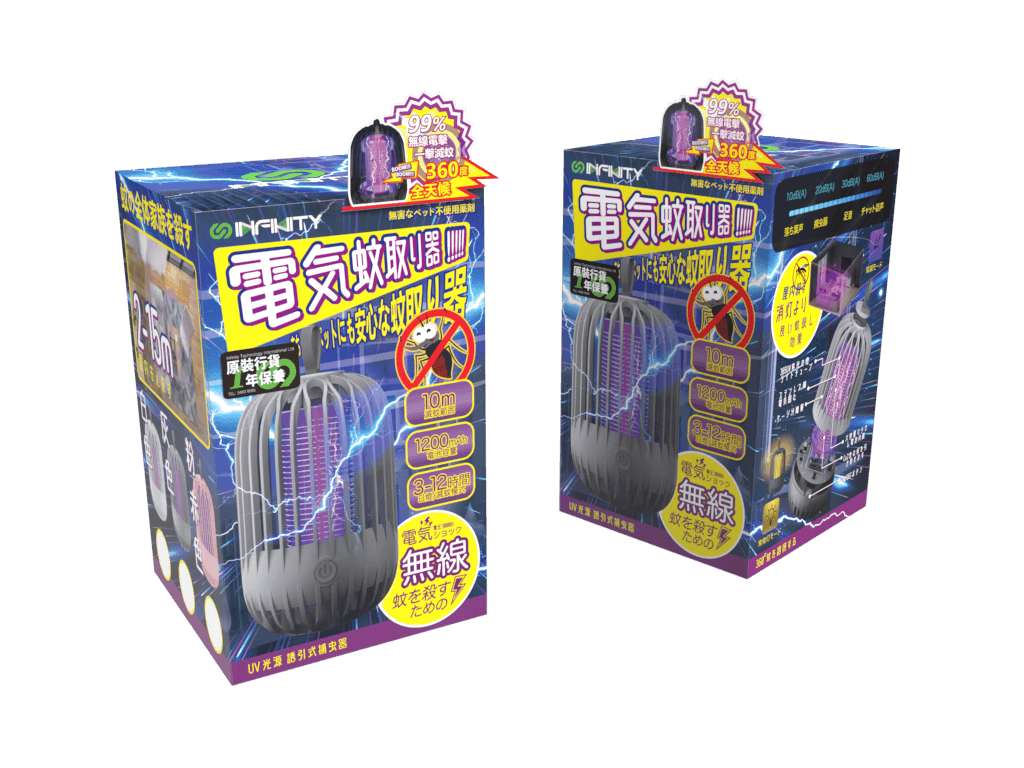
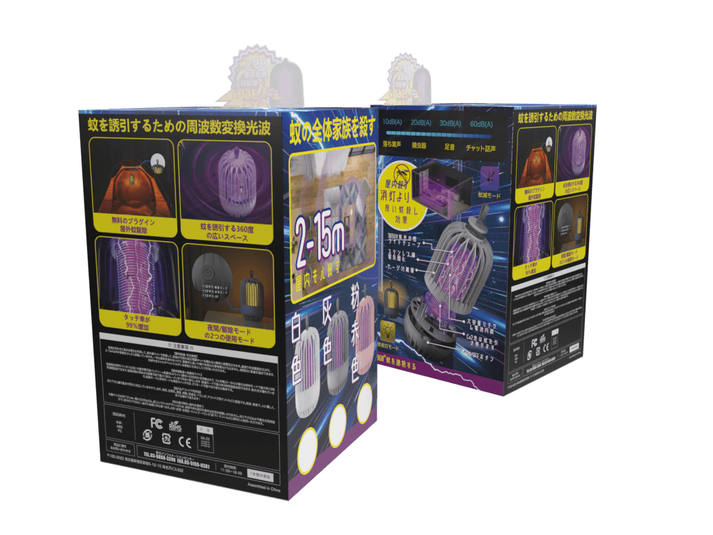
This high-tech silver card paper packaging showcases an electronic mosquito repellent device. The design mimics a nighttime bedroom setting, utilizing contrasting font colors to create a visually striking background. Abundant imagery clearly communicates the product's usage and application range.
The packaging design adopts a modern, minimalist aesthetic to complement the sleek, technologically-advanced nature of the mosquito repellent device. The use of silver card paper lends a premium, elegant feel, while the strategic placement of product shots and lifestyle imagery effectively conveys the device's functionality and target usage environment.
(MY APPROACAH)
Paper material: silver card paper
Thickness: 400g
Fonts: Title "Rond B Square", Content "Hiragino Maru Gothic ProN W4"
Printing quantity: 10 samples, 1000 for official printing + 5000 for final additional printing
Printing output: CMYK
Packaging craft: uv/foil stamping/embossing
(VISION & INNOVATION)
The design vision is to create a premium, high-quality packaging that instantly captivates the user and clearly communicates the product's key features and benefits. By leveraging the contrast between the silver card material and the bold, striking typography, the packaging stands out on the shelf and effectively highlights the device's technological prowess and suitability for the bedroom setting.
(CHALLENGES)
One of the key challenges was to strike the right balance between showcasing the product's technical capabilities and maintaining an visually appealing, user-friendly design. Additionally, incorporating detailed product shots and lifestyle imagery within the limited packaging space required careful planning and layout optimization.
(PROBLEMS)
The primary problem this packaging design aims to address is the need for a mosquito repellent solution that seamlessly integrates into the bedroom environment, providing effective protection without compromising the ambiance or aesthetics of the space. The packaging must clearly communicate the device's capabilities and ease of use to address consumer concerns regarding mosquito-borne illnesses and discomfort.

(USER-CENTRIC DESIGN)
The packaging design was developed with a strong focus on the user's needs and preferences. By depicting the device in a relatable bedroom setting, the packaging helps users visualize the product's intended use and appreciate its integration into their personal living spaces. The choice of materials and typography further reinforces the premium, high-quality experience the user can expect from the product.
(USER NEEDS)
The key user needs addressed by this packaging design include:
Effective mosquito protection in the bedroom environment
Seamless integration with the bedroom decor and ambiance
Ease of use and set-up for the device
Confidence in the product's quality and technological capabilities
Visually appealing and premium packaging that reflects the product's value